Instinctive Atmosphere
Year - 2023
Innocence
Royal Opera House
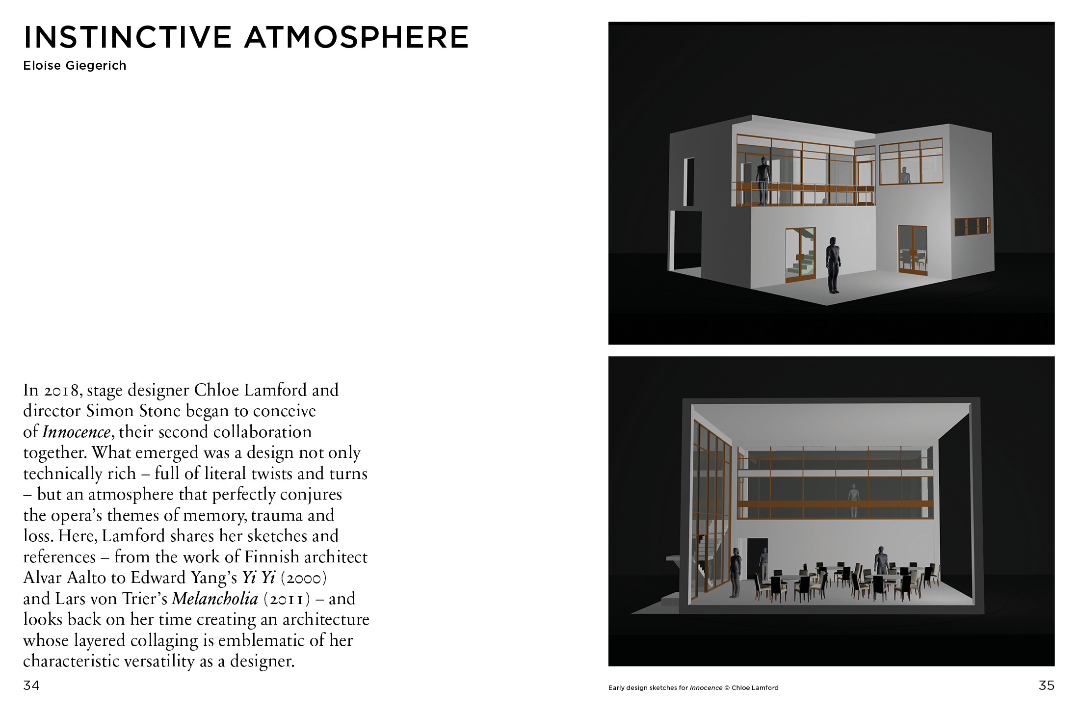
In 2018, stage designer Chloe Lamford and director Simon Stone began to conceive of Innocence, their second collaboration together. What emerged was a design not only technically rich – full of literal twists and turns – but an atmosphere that perfectly conjures the opera’s themes of memory, trauma and loss. Here, Lamford shares her sketches and references – from the work of Finnish architect Alvar Aalto to Edward Yang’s Yi Yi (2000) and Lars von Trier’s Melancholia (2011) – and looks back on her time creating an architecture whose layered collaging is emblematic of her characteristic versatility as a designer.
Eloise Giegerich: What was the process of designing Innocence?
Chloe Lamford: Working with Simon is particularly interesting because he creates spaces that are very theatrical, but they also have a real sense of place. So although the set is revolving and open to the audience, all of the interiors also have substance and a sense of reality. That’s the really exciting thing about working with him. The architecture is innately theatrical in terms of how it functions, and feels really atmospheric. Our process was examining architecture, and finding the right emotional space for this building that could move seemingly seamlessly between the restaurant action and memory space of the school, and that we could collage and create an architecture that could be all those things – that could be memory space and could be reality, and could be a space of loss and trauma. It was about researching and layering and finding all these different architectural and filmic references to build the right atmosphere.
EG: Were there challenges in trying to reconcile the present-day restaurant-wedding action with the memory space?
CL: The challenge was to create a space that could hold – because the opera jumps between these two realities – the reality of 10 years since the tragedy and then the reality of the incident itself. Simon’s amazing idea was that it’s the same building. So for me, it was really plotting through how each space could live against each other. It was a lot of working out how to do things secretly away from the audience so that you’re, as an audience, always experiencing its source of magic.
EG: When you approach projects, what do you look at for visual references?
CL: I look at film, I look at installations, I look at a lot of photographers. I really like to look outside of theatre and opera. Especially when your space needs to feel really real, or have a sense of reality.
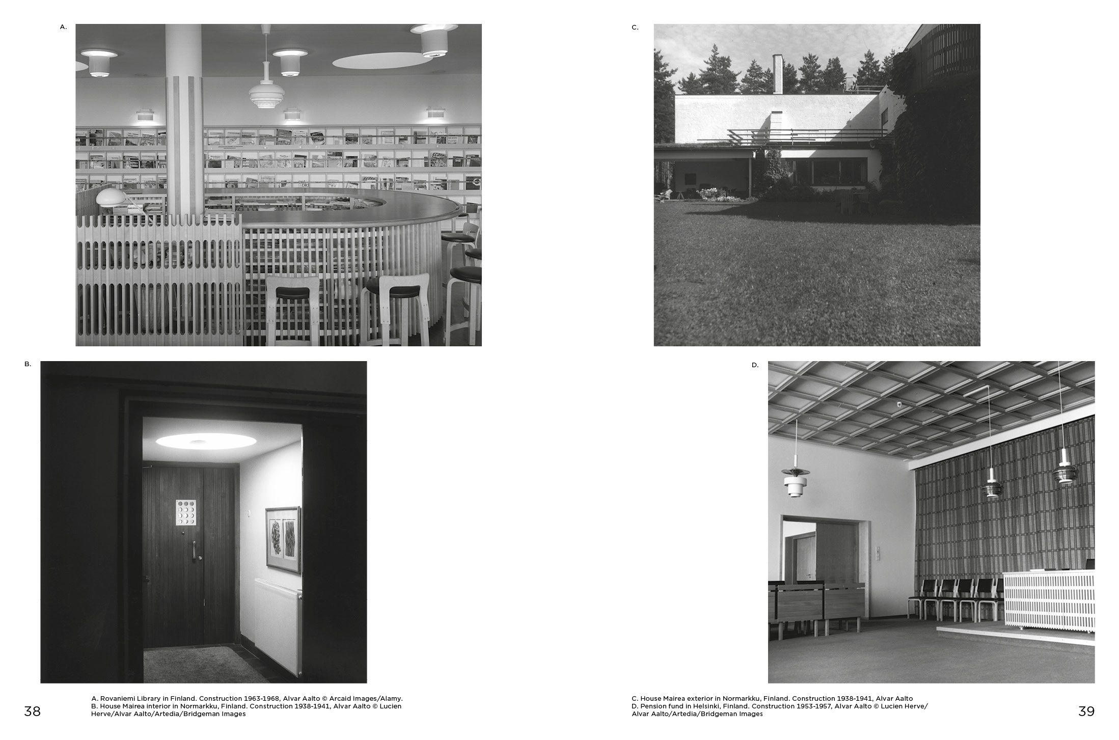
EG: You’ve cited Alvar Aalto as a reference. Are you and Simon fans of his? And given that the opera is set in Finland, did Aalto’s Finnish roots have any impact?
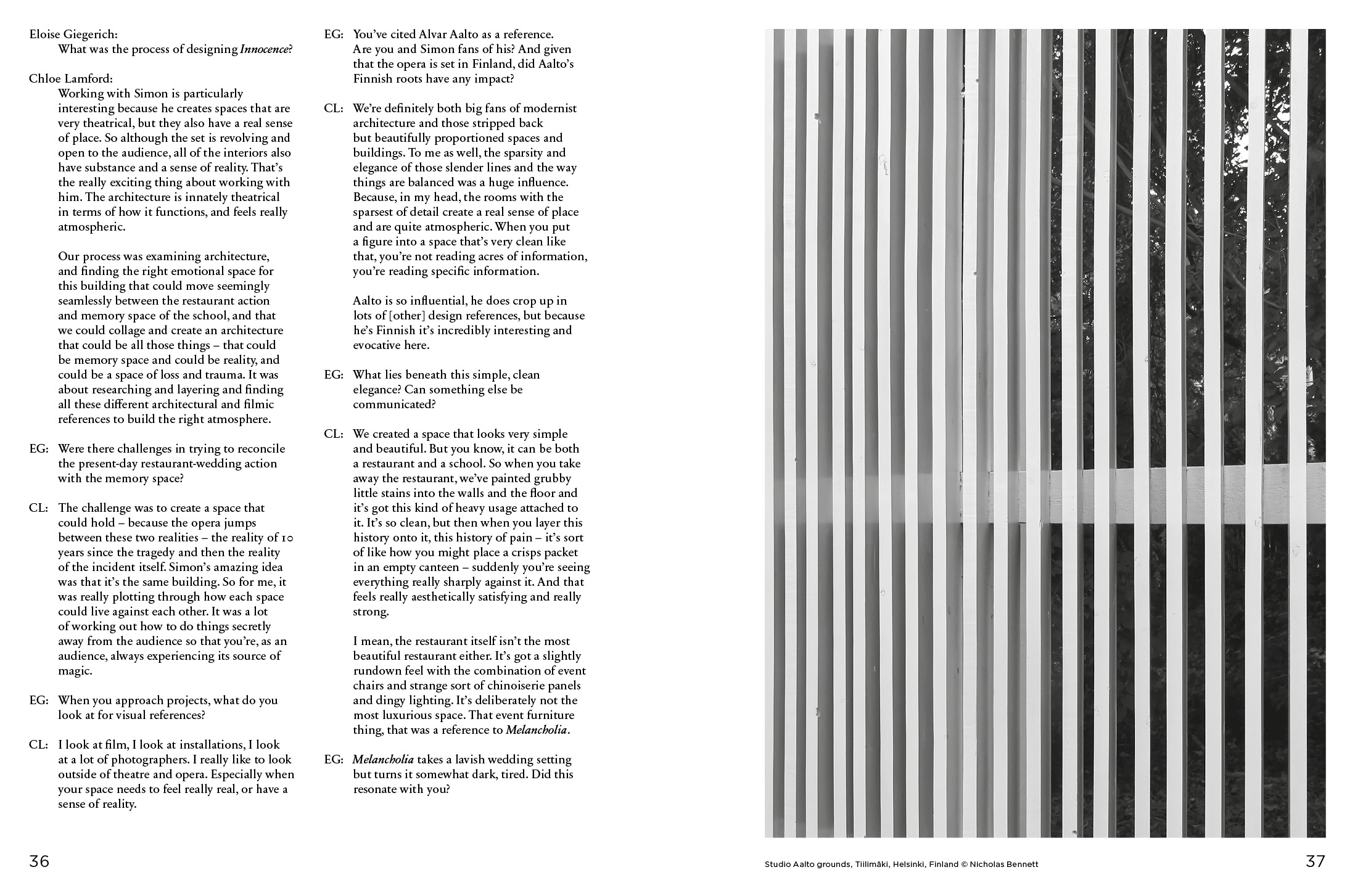
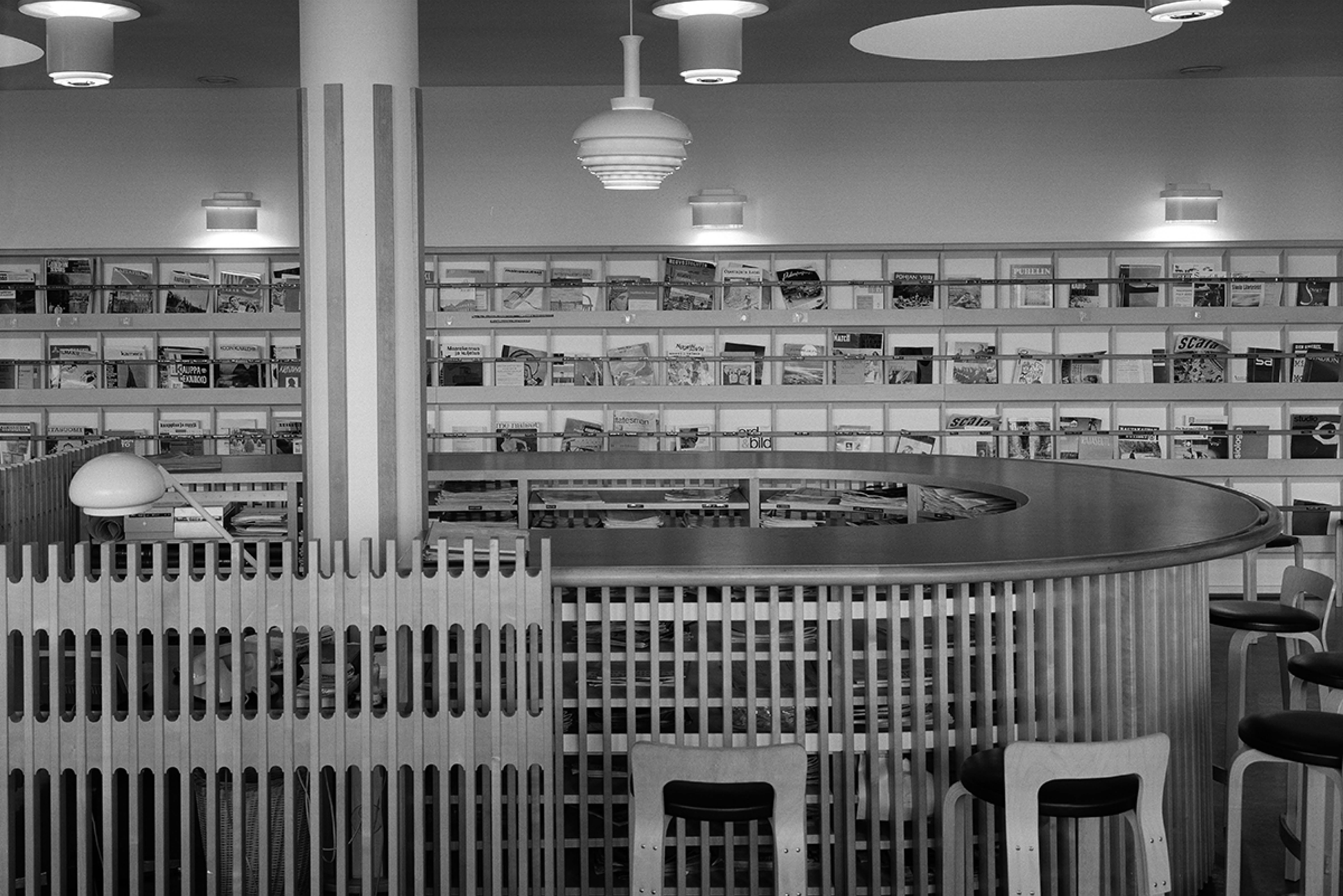
CL: We’re definitely both big fans of modernist architecture and those stripped back but beautifully proportioned spaces and buildings. To me as well, the sparsity and elegance of those slender lines and the way things are balanced was a huge influence. Because, in my head, the rooms with the sparsest of detail create a real sense of place and are quite atmospheric. When you put a figure into a space that’s very clean like that, you’re not reading acres of information, you’re reading specific information. Aalto is so influential, he does crop up in lots of [other] design references, but because he’s Finnish it’s incredibly interesting and evocative here.
EG: What lies beneath this simple, clean elegance? Can something else be communicated?
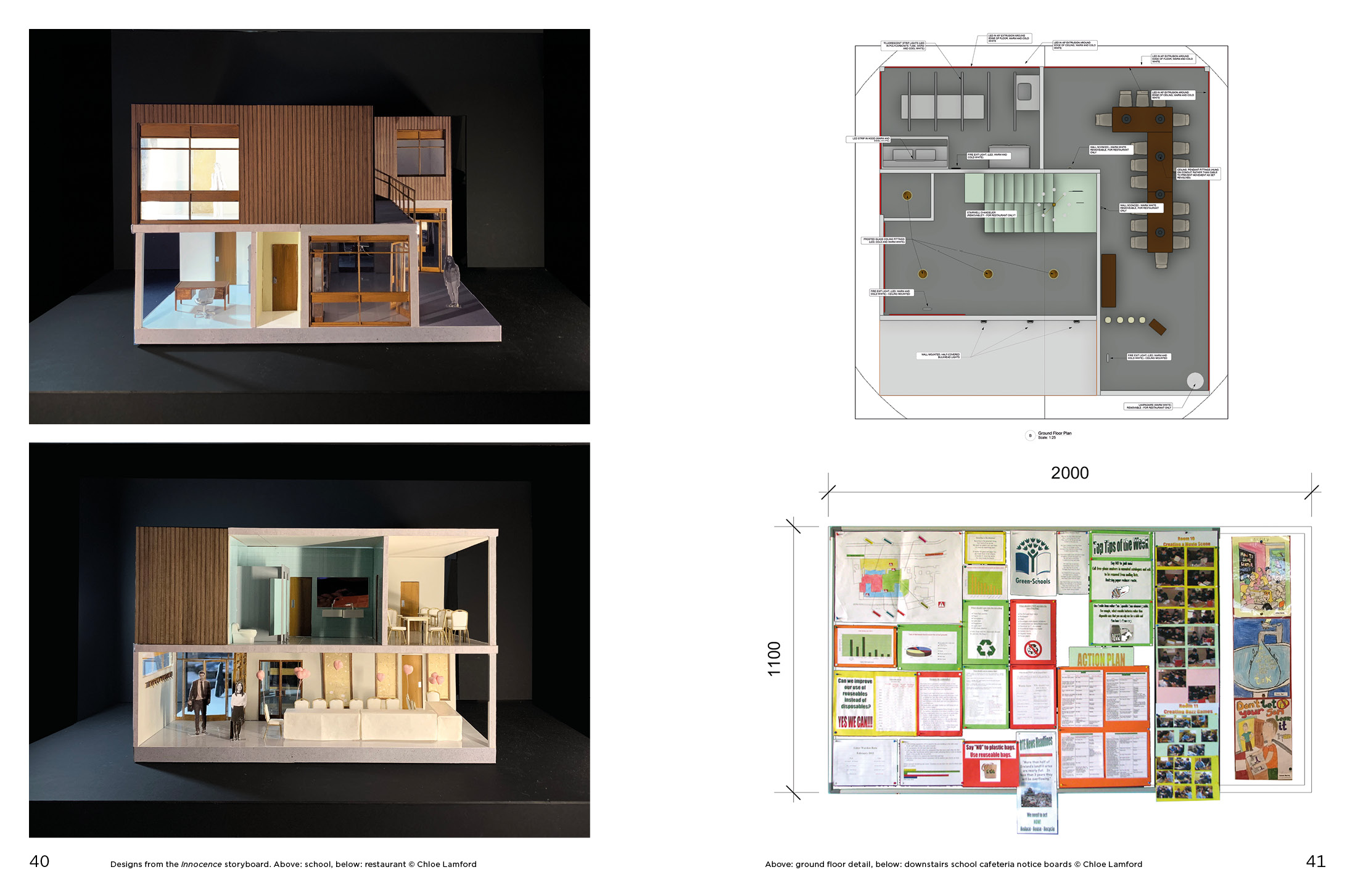
CL: We created a space that looks very simple and beautiful. But you know, it can be both a restaurant and a school. So when you take away the restaurant, we’ve painted grubby little stains into the walls and the floor and it’s got this kind of heavy usage attached to it. It’s so clean, but then when you layer this history onto it, this history of pain – it’s sort of like how you might place a crisps packet in an empty canteen – suddenly you’re seeing everything really sharply against it. And that feels really aesthetically satisfying and really strong. I mean, the restaurant itself isn’t the most beautiful restaurant either. It’s got a slightly rundown feel with the combination of event chairs and strange sort of chinoiserie panels and dingy lighting. It’s deliberately not the most luxurious space. That event furniture thing, that was a reference to Melancholia.
EG: Melancholia takes a lavish wedding setting but turns it somewhat dark, tired. Did this resonate with you?
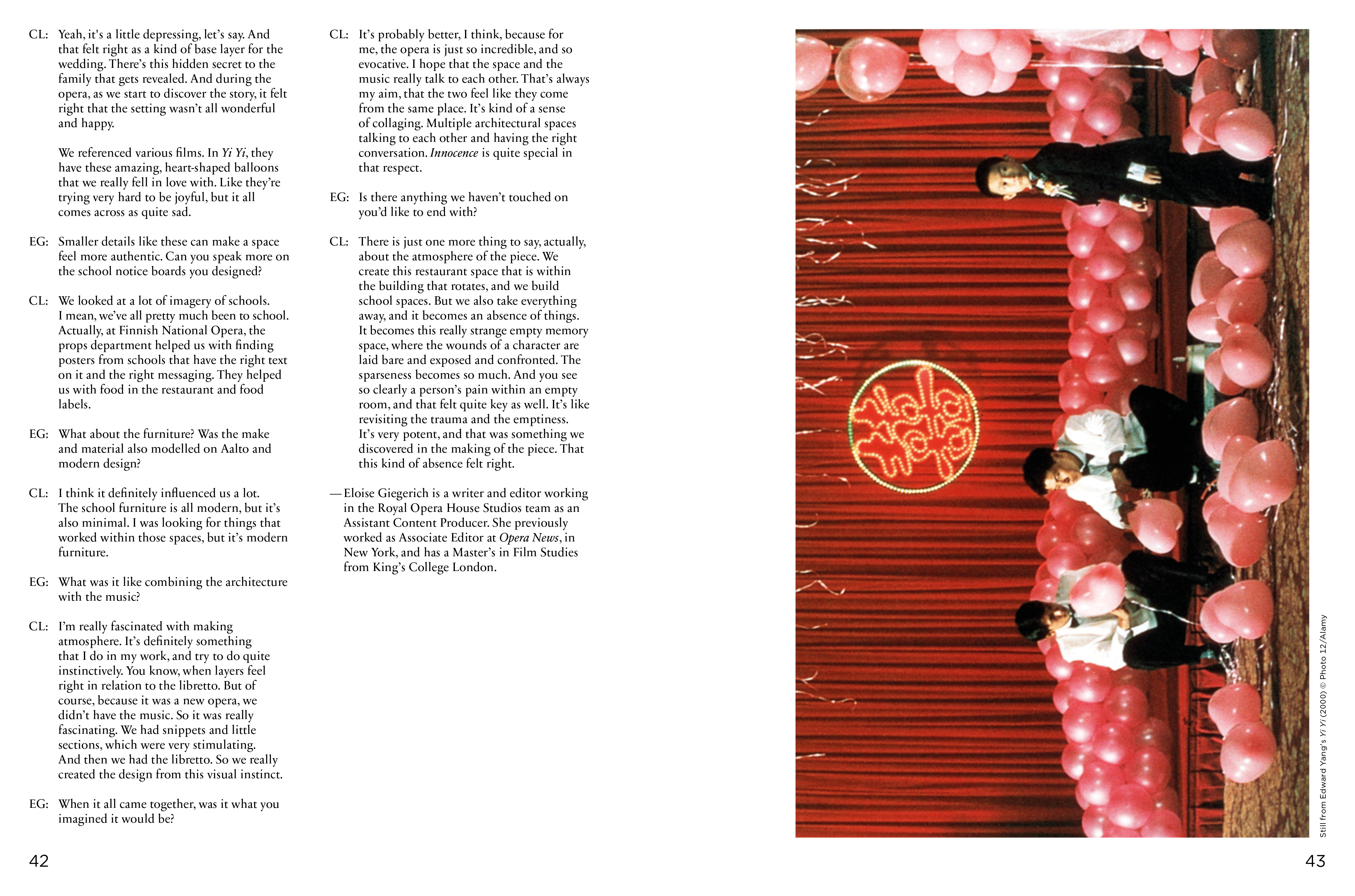
CL: Yeah, it's a little depressing, let’s say. And that felt right as a kind of base layer for the wedding. There’s this hidden secret to the family that gets revealed. And during the opera, as we start to discover the story, it felt right that the setting wasn’t all wonderful and happy. We referenced various films. In Yi Yi, they have these amazing, heart-shaped balloons that we really fell in love with. Like they’re trying very hard to be joyful, but it all comes across as quite sad.
EG: Smaller details like these can make a space feel more authentic. Can you speak more on the school notice boards you designed?
CL: We looked at a lot of imagery of schools. I mean, we’ve all pretty much been to school. Actually, at Finnish National Opera, the props department helped us with finding posters from schools that have the right text on it and the right messaging. They helped us with food in the restaurant and food labels.
EG: What about the furniture? Was the make and material also modelled on Aalto and modern design?
CL: I think it definitely influenced us a lot. The school furniture is all modern, but it’s also minimal. I was looking for things that worked within those spaces, but it’s modern furniture.
EG: What was it like combining the architecture with the music?
CL: I’m really fascinated with making atmosphere. It’s definitely something that I do in my work, and try to do quite instinctively. You know, when layers feel right in relation to the libretto. But of course, because it was a new opera, we didn’t have the music. So it was really fascinating. We had snippets and little sections, which were very stimulating. And then we had the libretto. So we really created the design from this visual instinct.
EG: When it all came together, was it what you imagined it would be?
CL: It’s probably better, I think, because for me, the opera is just so incredible, and so evocative. I hope that the space and the music really talk to each other. That’s always my aim, that the two feel like they come from the same place. It’s kind of a sense of collaging. Multiple architectural spaces talking to each other and having the right conversation. Innocence is quite special in that respect.
EG: Is there anything we haven’t touched on you’d like to end with?
CL: There is just one more thing to say, actually, about the atmosphere of the piece. We create this restaurant space that is within the building that rotates, and we build school spaces. But we also take everything away, and it becomes an absence of things. It becomes this really strange empty memory space, where the wounds of a character are laid bare and exposed and confronted. The sparseness becomes so much. And you see so clearly a person’s pain within an empty room, and that felt quite key as well. It’s like revisiting the trauma and the emptiness. It’s very potent, and that was something we discovered in the making of the piece. That this kind of absence felt right.
